
Architecture and interior design are closely related. Together they comprise the creative effect whose primary object is the composition of beautiful and functional space by using principles and elements of designing extensively. Therefore interior decoration is concerned with particular and special expressions, their furnishings, furniture, wall coverings, floor coverings, its accessories and other luxurious items finally governed by the way the room is set-up. “Art” is involved in most of the objects. Fundamentals to impart “Art” with good taste are of great need.
Good flexible guides to interior decoration and an understanding of its principles helps one to differentiate between rich and gaudy, and recognize the potential when the factor “beauty” changes the monotony in an imaginative world. With application of these principles, the meaning of interior decoration broadens and deepens. Training will show how merely a variation in proportion or addition of simple note of contact will result in quality and beauty that may otherwise be lacking.
Too often it is thought that “art” is synonymous with painting, drawings or sculptures; but every item in interior décor may have the expression of “art”. “Art” is of two kinds: –
- Visible
- Invisible
Art and designing are a process of choice, selection, organization, arrangement and equalization of items with each other and the upkeep of this with two aims – “order and beauty”. “Order” is that which denotes organization and set-up in structure. “Beauty” shows the character through the interpretation of art and idea by the individual.
“Art” has certain fundamentals which can be termed as elements and principles which are to be borne in mind while decorating interiors.
Principles of design –
Principles Elements Objectives
Proportion Line Beauty
Balance Form Expressiveness
Emphasis Texture Functionalism
Rhythm Colour
Repetition Pattern
Harmony Light
Space
The keynotes for achieving at the successful interior decoration art are the five ‘S’.
- Simplicity
- Serenity
- Spaciousness
- Suitability
- Sympathy
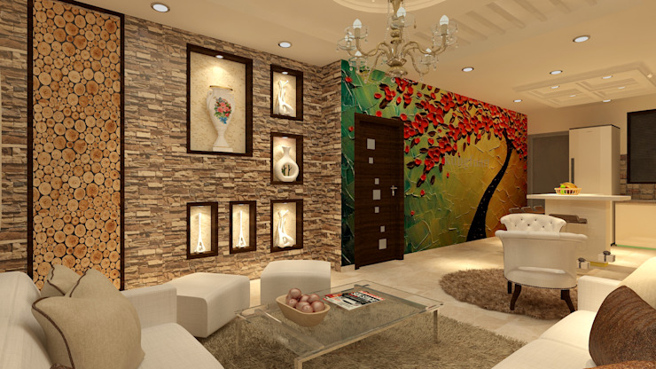
PRINCIPLES OF DECORATION
Proportion
The principle of proportion underlies all other principles. It states that the relation between areas, between parts of the same thing or different things of the same group should be satisfying. The implied measure of visual attributes like size, weight and color. It affects other design principles like balance.
Proportion also deals with relationship in size, shape, colour, light, texture and pattern.
The appearance of the exterior of a house is due to its proportions. First the total mass, which depends on the height in relation to the length, then the proportions of roof, walls and foundation, and finally the relationship of doors, windows, and other elements that must be organized into an unified whole.
The shape of the rooms and of every article of home furnishing should be judged by their proportions. Large furniture belongs to large rooms and small patterns are required in small rooms. To achieve good arrangement that holds interest, proportion between unity and space is required. An oblong with the ratio of sides as 2:3 is good proportion and is called ‘golden oblong’. Rectangle should be in ratio of 2:3 or 3:5 or 5:7.
Appearance can be changed by the use of strongly vertical or strongly horizontal lines. The latter tends to increase the width of the object or room, and the former makes a room appears lighter. The principle of proportion can be a guide in grouping together different sizes successfully according to scale. Furniture that seems to be small for a room should be arranged in a group so that the size of the group and not individual pieces become units for comparison.
The Greeks discovered something about the difference between a ho-hum room and a
beautiful one that isn’t immediately noticeable until you have the secret. They called it “The Golden Mean”….and it is like a small recipe. It says that you should think in percentages for color, mass, and even texture. You should have about 70% of any one thing; 25% of a related thing, and just 5% of a contrasting thing. So, if we take color or pattern as an example: If you paper the walls of a room (large percentage), then you can put a related stripe on a bedspread (the 25% item) and then, throw a contrasting color onto a pillow or two (the 5% thing).
Balance
Balance is fundamental in interior decoration. In an interior, balance must be attained in colour, texture, light, as well as weight, pattern and furniture arrangement. Balance is the composure or equilibrium of forces. In furnishing a room, it can be achieved by the arrangement of windows, doors and other details around a visual center. Other factors are relationship of larger pieces to one another, and to the background features of the room, the distribution of light and dark colors and careful selection of textures
Balance is the result of equalization of attractions on either side of the central point. Balance is analogous to nature; the great equalizer that provides a constant to the space in which it exists. Criteria can be a comparison of one element such as color or of several elements such as pattern, texture, or layout. Lack of balance can also be used to portray spontaneity in a room.
There are two types of balances –
Formal balance and Informal balance
- Formal balance – Formal balance results when objects of equal weight are placed on either sides and are at equal distance from the center. When the objects are identical, the balance is symmetrical and formal.
- Informal balance – Informal or asymmetrical balance results when a large object balances a smaller one away from the center. There are many variations of informal balance.
Informal balance is more creative than formal balance as there are no rules to guide one, whereas formal balance is less difficult, less subtle and more passive than informal balance. Large objects placed close to a visual center may be balanced by smaller objects placed at a distance from the center or by the use of brighter colours which provide more eye attraction.
They are also sometimes termed as symmetrical and asymmetrical balance.
The type of balance created in interiors helps in determining the mood and effects created. Therefore it is not desirable to create a formal balance in a simple or small room or informal interior.
Formal architecture and stately homes require formality in furniture arrangements and display of accessories.
Balance is the most important principle employed in furniture arrangements.
Emphasis
Every interior or room should, if possible have a dominating colour, idea or form. A center of interest – this principle is known as Emphasis. Direction the eye travels and dwells as it first sees the room. This can be affected by elements and principles including visual weight, color, proximity, line, and layout of the space.
In order to place emphasis on any special feature, others must be subordinated or simplified. Emphasis can be created at any desired point in a room by using art components in a dramatic way. Its success is dependant on
- What you choose to emphasize
- How you choose to emphasize
- Where you place the emphasis
A large room may well have secondary points of interest also. Some decorators distribute the emphasis so that observers will give attention to the accessories, the furniture, the floor and the walls – in this order. Sometimes this order is deliberately reversed to withdraw attention from things, which should be minimized. For example non-descript furniture can be eclipsed by beautiful accessories – carpets or patterned curtains. Although the floor is not the place to focus attention, some carpets and rugs, especially Oriental carpets are so conspicuous, that they cannot be obscured. If a patterned and decorative carpet is used, the only solution is to subordinate everything else in the room. Certain areas or objects can attract attentions23 by grouping them, using contrast colors or value, having sufficient space around or using unusual lines or space or sizes. Figured wallpapers make poor background for objects placed against them since objects have no chance for attention.
If possible every room should have a center of interest, which is the most important point in the room and should be worthy of the attention given to it. The test for judging emphasis is simplicity and beauty.
Emphasis may be placed on: –
- An attractive set of furniture.
- Colour
- Unusual form in a room.
- Paintings or accessories.
- Texture.
- Pattern – e. G., curtains, carpets, walls, upholstery, etc.
- A window or windows with a beautiful view.
The amount of emphasis suitable for interior decoration cannot be stated definitely. It depends partly on the state of the room and the people who live in it.
Rhythm
Rhythm is organized movement in continuity. It occurs in regular, repeated movements and also in variable transitional movements. It is the related eye movement by which the eye travels in an arrangement by means of lines, forms and colors. There is no eye movement in a plain area but when a pattern is introduced, the eye begins to travel and movement is created. The continuity or lack thereof that creates stimulating design
Regular measured rhythm is the easiest and the oldest way of creating harmony and it is an important element in architecture and interior design. It is a system of regular accenting that is found in a row of duplicate columns or in a striped fabric.
Rhythmic eye movement is gained through repetition of shape, radiation of colors, and proportion of sizes of different objects, patterns or use of continuous eye movement. Repeated forms, colors and figured surfaces in a room are examples of rhythm by transitional lines. Emphatic rhythm movement should be restricted for small areas. The main line of each group of furniture arrangement should confine itself to the lines of the room.
Variable rhythm is found in irregular intervals of dissimilar parts. This rhythm may carry the eye along smoothly flowing lines or it may force the attention abruptly here and there in order to convey the desired emotional effect. This type of rhythm is employed to attract the eye throughout a painting until it is seen as a whole. Such rhythm unites all the articles in a group of furniture and also connects each group with adjoining groups.
Repetition
Repetition is closely related to rhythm, for its use may result in rhythm. Repetition is necessary in producing beauty and it is the simplest way of achieving order. A theme or certain colours should be repeated in a room or interior for the purpose of making a composition. Lines, shapes used in any room should be harmonious and repeated for the sake of unity.
Harmony
This refers to elements working together to form a visually pleasing cohesiveness. This means unity of simple ideas and expressions. Everything in a room is subordinated to simple or sensible ideas. The type of expressions or words by the use of colors, lines, sizes and textures. For example, damasks are beautiful but not suitable in cottages. The qualities and characters that are expressed in interior design maybe social, domestic, impersonal, healthy or secretive, in addition to masculine or feminine. Rooms which express a domestic quality are likely to be informal, friendly and intimate. Rooms which are masculine on quality normally have a sturdy texture, bolder column or line and heavier scales are used, than feminine ones in character. The patterns in feminine interior design would be dainty and feminine.
Minor Principles
Alteration – means repeating two lines or forms alternately
Parallelism – refers to the use of parallel lines or form
Symmetry – results from two vertical halves
Contrast – means opposition of things and qualities. It is a visual tension. Day and night is an example of opposition. A work of art with contrast or opposition stimulates interest and rouses excitement.
Transition – is referred to the method which increases rhythmic movement from one line or form or color to another. Transition adds beauty to any design.

The triangle has sharp corners. As the eye follows the shape, it must make abrupt change in direction at each corner. In the second figure, the eye can travel around the figure easily due to the curved lines.
Unity – Unity refers to the designer’s concept and the honesty and thoughtfulness that are brought to achieve the concept. Through repetition and similarity, a single motivating idea emerges. When you design a home, make every effort to have the objects and colors relate to each other in some way. Use repetition of color, pattern, line and shape to establish unity. But use creative thinking to avoid being stuck in the theme. Too much unity becomes monotonous.
Variety – Vary your colors, shapes, patterns and themes within the rooms, but don’t sacrifice unity to do it. The right combination of variety and unity will bring harmony to each room and ultimately to the home.
ELEMENTS
Line
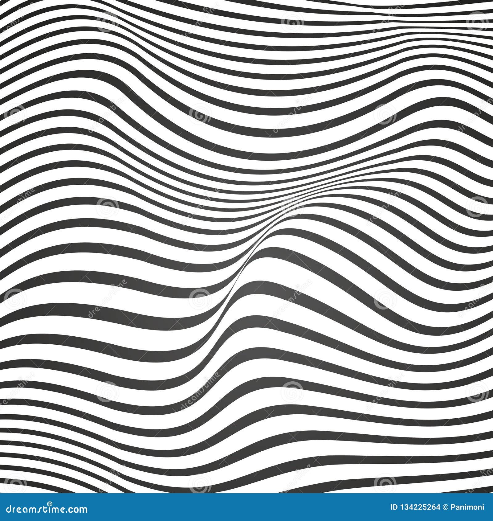
Most designs are composed of many lines and there is often a predominance of one type that contributes to the character of the design. Lines compel our eyes to follow them. Line is a progressive movement or declination. Line is used to convey its own intrinsic beauty or symbol to direct the eye over a given course. A line is a force which can effect the eye movement. The different position of a line plays the most unexpected tricks which can be termed as “optical illusions”
There are two types of lines – straight and curved
Straight (erect, upward) lines when vertical suggest strength and forcefulness, and are likely to be dignified, masculine and formal. In interior decoration vertical lines tend to suggest apparent height of the room. In rooms with low ceilings, vertical lines should be used to make the room look taller. Horizontal (sideways) lines suggest response and relaxation. It increases the width of a room and gives a feel of informality. It can be provided with furniture like table, benches, sofas, etc. Diagonal lines suggest action as they keep the eye moving. This action can be cut down making the diagonal lines meet and stopping the action.
Curved lines express many different moods or ideas. Circular or voluptuous curves express a feeling of gaiety. Softer ‘S’ shaped curve may express gracefulness and refinement. But too many curved lines can produce restlessness.
Line combinations in the structural features of a room, furniture designs, accessories and patterns must be carefully considered to achieve the desired effect. A composition with too much of any one type of line may become uninteresting or unpleasant, but emphasis on one type helps to promote the theme.
Form
Lines are so much part of form that it is difficult to consider them separately. The term line is applied to two-dimensional areas or shapes, but when it acquires three-dimensional volumes or masses it becomes form. Form is a structure. Shape and form are terms that are used interchangeably, but shape can be understood in terms of pattern while form in terms of mass. Form refers to the whole organization of an object. Beauty of form depends on the relationship of the different parts to the whole.
There are basically three categories of form:
- Rectilinear – square or rectangle
- Angular – triangle or pyramid
- Curved – circle, sphere, cone or cylinder
Form is one of the most important elements in interior designing. Most interiors illustrate a combination of forms. Repetition of same forms can become uninteresting. Even utilitarian articles can be beautiful in form. The two essentials of good form are –
- The form of an object should suit it’s function
- The form of an object should be strongly influenced by the material with which it is made.
Harmony of form is essential in assembling of furnishings. The dominance of one kind of form or shape unifies a room. Different or diverse forms and lines in a room lead to disharmony. Even accessories should confirm to the dominant line of the room.

The straight lines in the first figure show a quite atmosphere while the curved ones in the second one expresses energy and windy atmosphere.
Texture
The word texture refers to the visual and tactile quality of the surface of any object. The tactile quality can be felt and enjoyed with touch; like smoothness of silk, softness of velvet, roughness of stone, etc. Texture can also be felt without feeling, that is the visual quality; like lit candles, flames of fire shades of a picture, etc. The pliability or rigidity of objects also has textural significance as it affects the quality of the surface.
Texture is an element of art that is valuable in giving character and beauty to objects, textiles, interiors, buildings, etc., as it plays a prominent part in all the visual arts. Juxtaposing hard and soft accessories creates balance
One of the first decisions to be made in furnishing a room or a house is the selection of the furniture wood, the polish that must be used on the furniture, and the style for all other textures must be in harmony with the furniture. For e.g. mahogany and rose wood suggest elegance and require delicate texture like silk, satin, velvet, combined with deep piled rugs. The accessories should be delicate and fine like crystal and silver. Obviously mahogany and wax polished teak wood furniture cannot be combined. Coarser wood requires textures like rough silk, cotton with copper or brass hardware, ceramics, wrought iron, etc. In a rough cloth there is suggestion of depth caused by the rays of unevenly reflected light.
Even in a single article texture problems are present (if more than one type of material is used), as only agreeable textures should be combined. For e.g. a metal chair looks good if upholstered with leather as both of them are sleek.
Refinement in appreciation of texture suggests that a relationship exists between colour and texture. Coarse textures and dainty colours are not harmonious, whereas fine textures and pastel colours are consistent.
It is important while decorating a room to ensure that the texture employed do not clash with one another. The texture of a single article should never be considered separately, but as a contribution to the total effect to the room.
Some examples of rough textures are – brick, timber, wicker work, carpets, coir and sisal, suede, linen, furs – these elements create a rustic natural homely feeling.
Some examples of smooth are glass (not patterned) chrome, plastic, lacquer paint finish, Vinyl upholstery, High Gloss paint finish, chintz fabric – these elements suggest a harder crisper formality to a room.
Comfort is an effect which can be created by clever choices in soft textures, using soft fabrics like velvet or cotton on sofas, rugs over hard flooring and by scattering cushions and throws over chairs.
Pattern
Pattern is a two-dimensional or three-dimensional ornament arranged in a motif. Because textures and forms can create patterns, the entire arrangement of the room creates a pattern. Pattern has a movement and should be arranged so it will flow with the rhythm of the room or the object it adorns. Pattern should not compete with the major focal point in the room, and too much pattern will make the room seem busy.
How to use pattern: –
- Most often a pattern accent is at it’s best against a neutral background
- Usually bold patterns call for a large massive area, but this guideline also needs to be viewed in terms of its exceptions.
- Using the same pattern on many pieces is a good way to achieve harmony.
- Mixing prints should be done with skill and a feeling for colour and design. Two patters of the same colour may be effectively combined if they are of related styles and design scales. The same pattern in another related colour may combine well.
- Geometric patterns may be combined with floral, if they use the same colours; the dominant colour could then be used in solid areas of the room.
Size, scale and proportion should be taken into consideration with pattern. You can generally get away with using small patterns on large pieces of furniture, but the same cannot be said for the reverse. Large patterns on small items of furniture can weigh them down and look too overpowering and dominant as well as out of proportion. A small pattern or texture is generally a better choice. It is often wise to use two or three different pattern sizes, small medium and large, and relate these back to the items that you will be using them for in the room. I.e. a large floral pattern on the sofa, with small floral print cushions, medium width striped walls with a medium floral for drapes and a small stripe for the footstool. While making these selections we must also remember that pattern will make a room looks smaller no matter what size pattern or color way you use. There are no hard and fast rules with pattern, you can use geometrics with floral, textures and stripes, it is all a matter of balancing the weight of the patterns to the items they will be covering and the overall look that you are trying to achieve.
Space
The element called space can be used to increase the size of the room visually and to give the room a quite feeling of rest and beauty. Any form to be seen clearly needs space around it to create the sense of edge that defines its shape. Space is the working area with which we compose a picture. The utility of any room depends on the empty space in it. The feeling of spaciousness can be achieved by using light colours, use minimum contrast, use floor-to-ceiling glass, use illusionist devices like mirrors, scenic wall papers, use lighting that emphasize the ceiling, curtains with valance lighting, use furniture with legs, etc.
find design in notes….. download now
The first design has equal space left all around and hence looks poor. In the second the object is in the corner and the rest of the space is out of balance. It looks unrelated to other objects. Third design has pleasant balance.
DESIGN
Designing is defined as any arrangement of line, form, space, colors and texture. There are two types of basic design: –
- Structural design
- Decorative design
Structural design is made by the size, from and texture of the object.
Decorative design is the surface enrichment of structural design.
Structural design is more important in some cases than decorative design. For e.g. in hospitals, offices, kitchens etc. structural designs is important and essential to every object, while decorative designs are luxurious, e.g. in guest rooms, etc. windows are structural designs while curtains are decorative designs. Embroidered towels, decorated service trays are examples of decoration interfering with functions of objects.
Requirements for a good structural design: –
- It must be suited to the purpose
- It must have good proportion
- It must be simple
Requirements of good decorative design: –
- It should be used in moderation
- It should be placed at structural points to follow the shape of objects
- There should be enough background space
- The space should be beautiful as the pattern placed against it
- The decoration should suit the material used against it
One way to approach the object of selecting, decorating, balancing, assembling and furnishing a place is to express some definite idea or theme in it. A well designed room should carry a message of cheer, rest, power, repose, satisfaction, freshness, welcome, warmth, coolness, richness, intimacy, privacy, importance, delicacy, strength in addition to all other facilities. Sometimes coal or log fireplaces, false ceilings, plasters or bricks or beams shown out may bring in natural beauty.
The establishments of today function as machines. Every phase of planning should be based on functions with places to sit, sleep, eat, relax, play, etc. the establishment should provide enough facility to its occupants to find place for comfort, relaxation and recreation which are the basic requirements.
Researching the most appropriate elements and their coexistence for the interior design project becomes much easier when the following questions are asked:
- What type of improvement can the interior design budget sustain? Remodeling for architectural detail or replacing the window blinds?
- What quality or price point will the budget support?
- What is the feeling the room should portray to a guest or occupant?
- What realistic level of maintenance can be supported (low, med. high) for the product being considered?
- Does the element need a qualified installer or can it be done easily?
- Is the style a trend or a classic style? An example would be a retro 1970’s look or contemporary style respectively.
- What color scheme is in use? Can the old and new be combined effectively?
- Is the layout conducive to traffic flow and ergonomics?
- Do patterns overtake the room creating a feeling of visual clutter?
- What textures would enhance the mood of the room?
- What style are the elements in the current room, and is that style still acceptable?